Why Every Church Needs a Modern Website in 2026
In 1517 a monk named Martin Luther nailed 95 theses to a wooden door in Wittenberg. That door was the community bulletin board — the place every traveler, merchant, and townsperson would pass on their way into the sanctuary. The Reformation did not begin on a pulpit. It began at the front door.
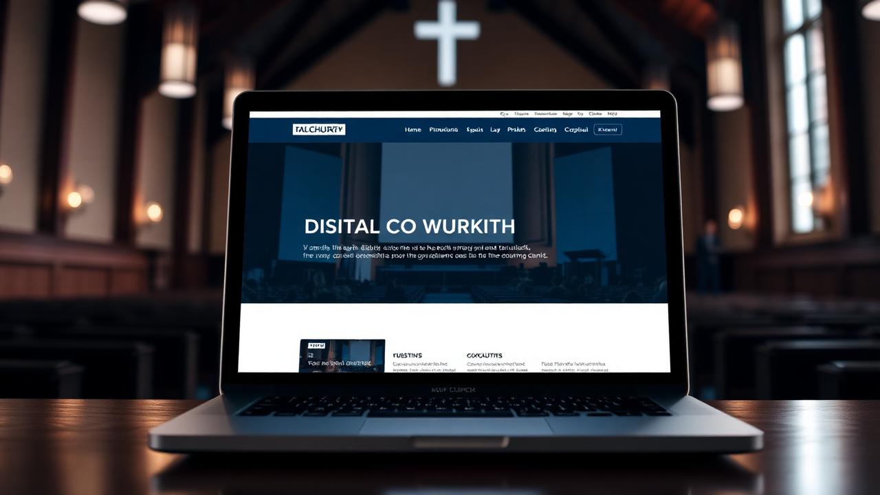
In 2026, your front door is a screen.
"How then shall they call on Him in whom they have not believed? And how shall they believe in Him of whom they have not heard?" — Romans 10:14
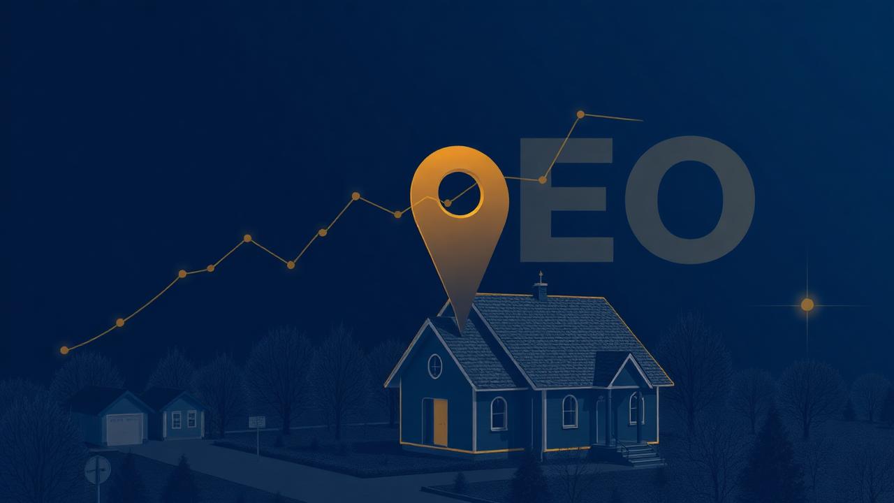
More than 70% of first-time guests visit a church's website before they ever consider visiting the building. That single tap on a glowing rectangle is your first sermon to them — and the website is preaching whether you wrote that sermon intentionally or not.
The Five Things a First-Time Guest is Actually Looking For
We have watched thousands of session recordings from real church websites. Visitors almost never read your "About" page first. They scan, hunting for five things — in this order:
- What time is your service, and is it today?
- Where exactly do I park, and what door do I walk through?
- What should I wear, and what will my kids do?
- What do you actually believe?
- Is there a real human I can talk to before I show up?
If those five answers are not visible within seven seconds, most visitors leave. Not because they rejected the gospel — because they could not find the welcome mat.
The Three Marks of a Set-Apart Church Website
1. Clarity over cleverness
The Word of God is clear. Your website should be, too. One headline. One next step. One phone number. Resist the temptation to cram thirteen ministries onto the homepage.
2. Hospitality over performance
A good website feels like the parking lot greeter who walks you in — not the stage lights of a concert. Warm photos of actual humans (not stock photos of strangers), a real welcome video from the pastor, accessible language that does not assume insider vocabulary.
3. Stewardship over showmanship
Fast load times. Accessible color contrast. Captioned video for the hearing impaired. Translated content for the immigrant family three blocks over. These are not technical luxuries — they are the digital equivalent of widening the church doors.
The Cost of an Invisible Door
We recently audited a 600-member church whose 14-year-old website took 11 seconds to load on a phone. Their bounce rate was 84%. That means for every 100 souls Google sent them, 84 left before the page even appeared. Multiply that across a year and the math is heartbreaking.
A church that prays for revival but cannot be found online is, with sincere love, praying for revival with one hand tied behind its back.
A Word to the Weary Pastor
You did not enter ministry to manage CMS plugins. You did not surrender your career to chase Google algorithms. You were called to shepherd souls. The tools exist now to give you a digital sanctuary that preaches the gospel 24 hours a day, in 40 languages, on every device — without requiring another evening away from your family.
That is the work we are honored to do. Our team designs, builds, hosts, and stewards church websites so pastors can return to the pulpit and the bedside. If your digital front door is tired, slow, or invisible, we would consider it a joy to talk.
Want help putting this into practice?
Our team helps churches, ministries, and Christian business owners turn insight into execution.
Schedule Free Consultation